Real screens from the shipped product
Meetzy is a social app for finding people to go to things with. Not a listings app and not a ticketing app — the event is the excuse, and the product's real job is the match. It has been live for about three months and around 2,000 people have signed up.
- Role
- Product, design and engineering
- System
- Discovery, profiles, join requests
- Platform
- Mobile app
- Status
- Live
- Live for
- About three months
- Signed up
- Around 2,000 people
- Built by
- One person
The hard part was never the event. It was the company.
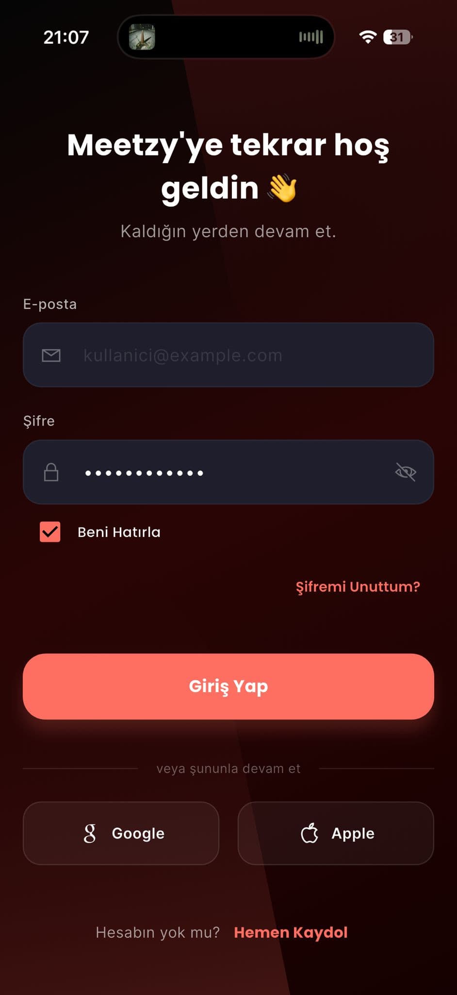
- 01Accounts and sign-in
- 02Mood-led discovery
- 03Events by distance
- 04Map
- 05Structured profiles
- 06Join requests and their states
- 07Notifications, both sides
- 08City memories
Every area listed is visible in the captures on this page or was stated by the person who built it. Nothing is inferred from what an app like this usually has.
The problem
There is no shortage of things to do. There is a shortage of someone to do them with. People scroll past a concert, a match, a table at a café, and decide against it — not because the event was wrong, but because going alone was.
So Meetzy is not built around events. It is built around the person you would be sitting next to. Everything in the interface exists to answer one question earlier: would I want to spend an evening with whoever is behind this.
Discovery
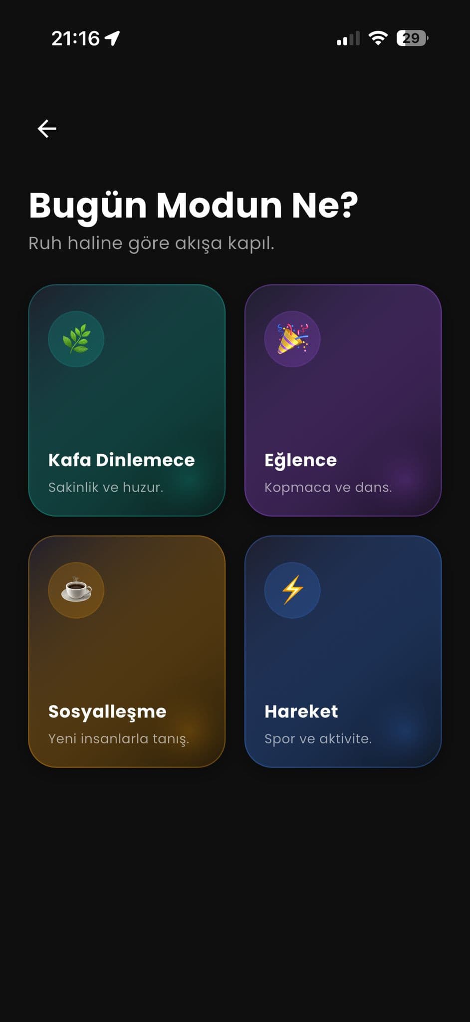
Discovery starts from mood rather than category. You say what kind of evening you are after — something quiet, something social, something active — and the app narrows from there. It is a smaller question than "what do you want to do", and people answer it faster.
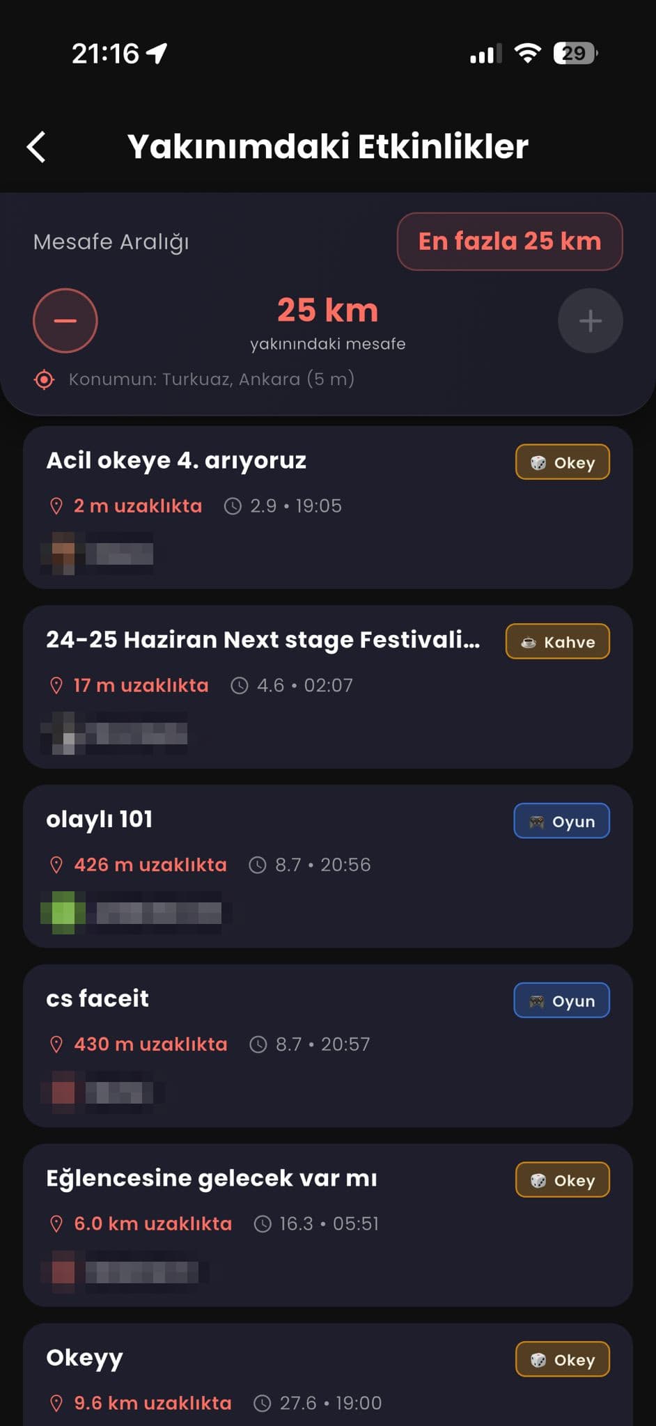
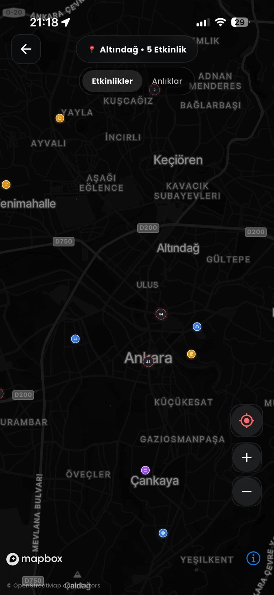
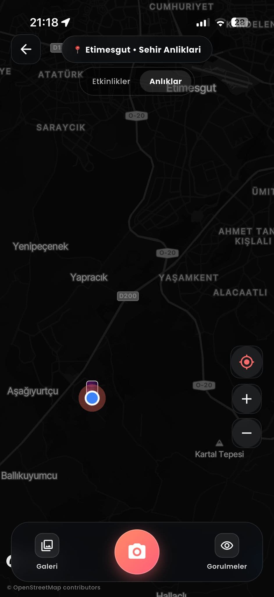
From there, distance does the rest of the filtering. Events are listed by how far away they actually are, down to metres, and the same set is available on a map. Nothing is more than a couple of taps from the point where you decide.
Asking
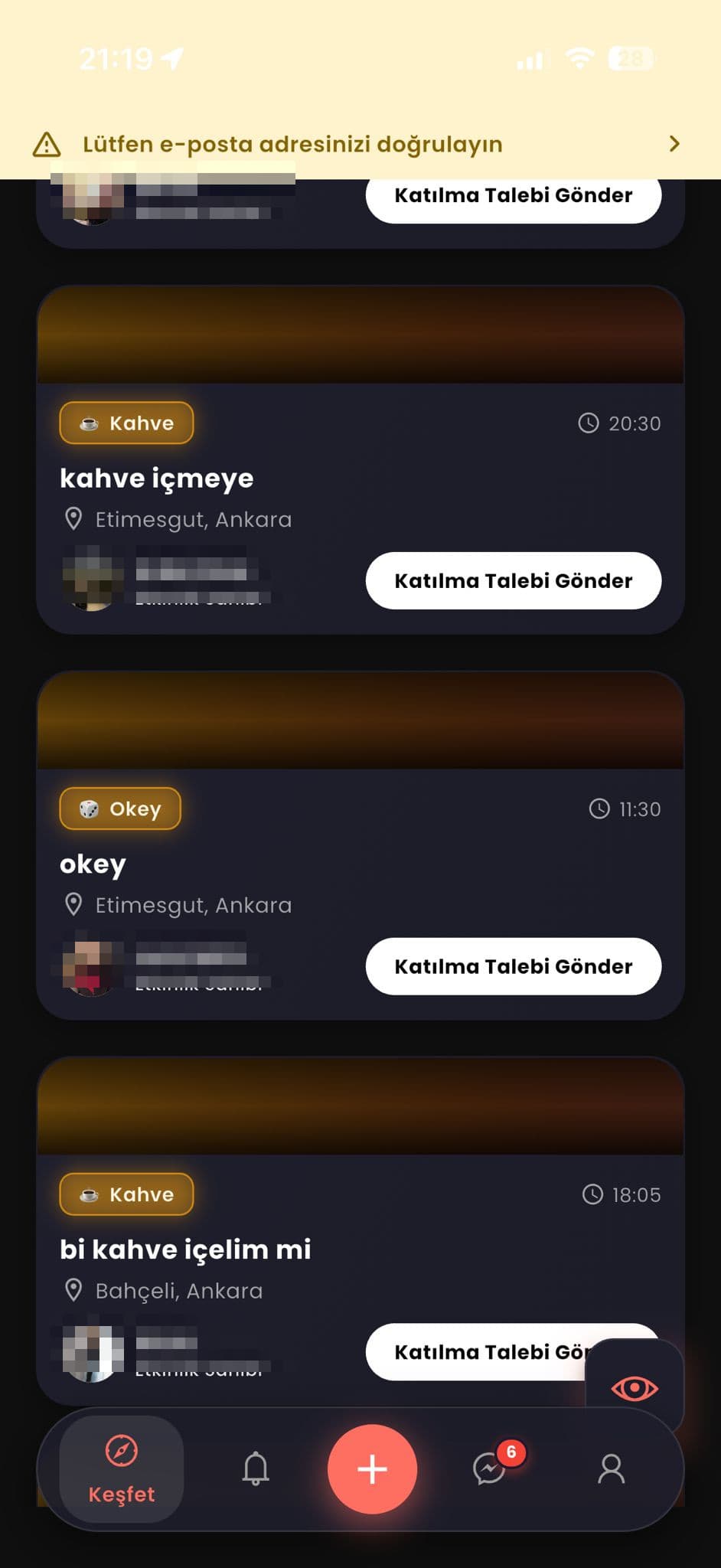
You do not simply appear at someone's table. Every event has a host, and joining is a request that the host accepts — which is the difference between an open listing and a social product people are willing to use.
That single decision pulled a lot of the system behind it: requests and their states, notifications on both sides, the profile that has to be good enough to say yes to.
The profile
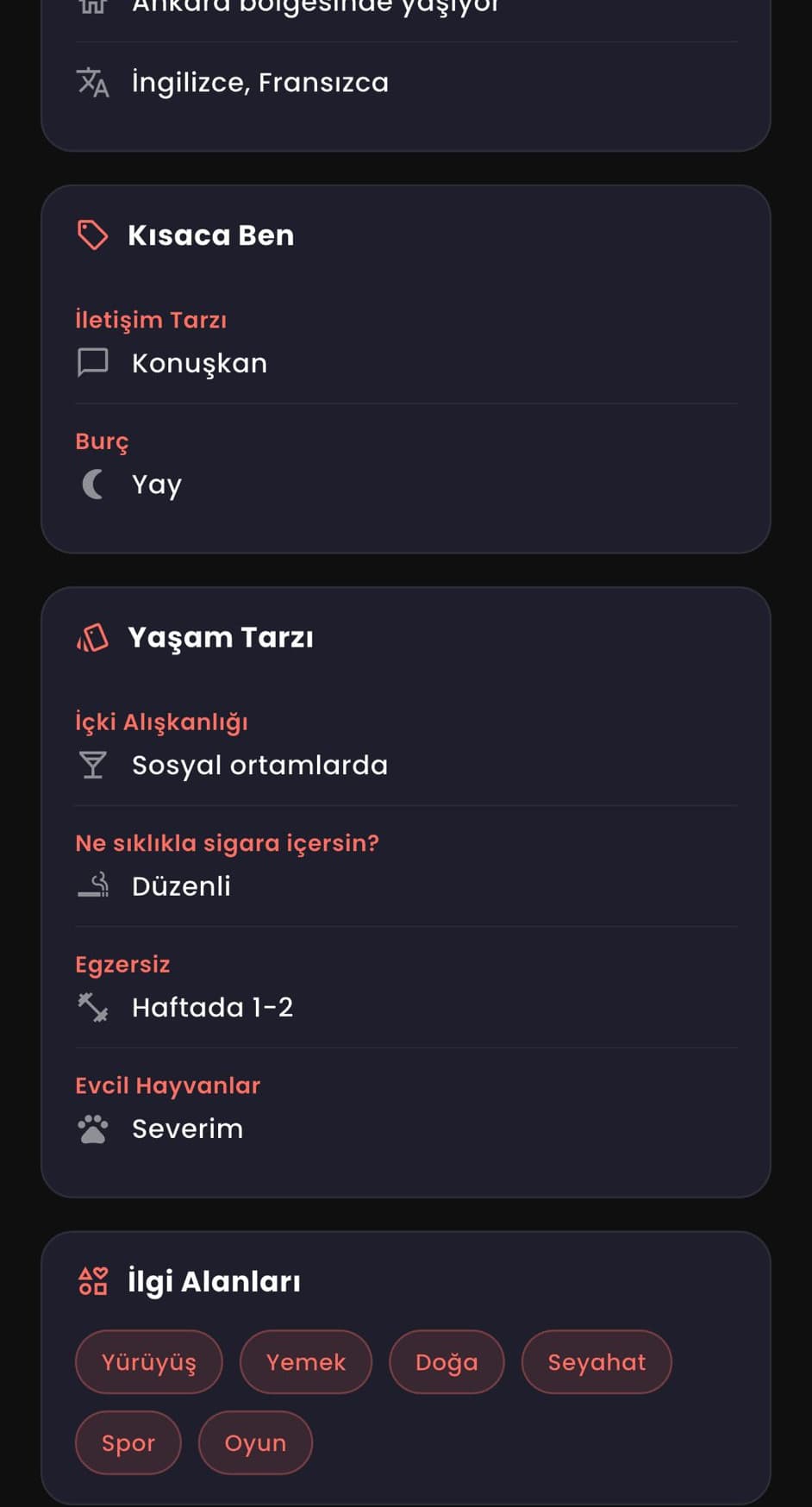
A profile here is not a photo and a bio. It is structured: how someone communicates, how they live, what they do at weekends, what they are into. Enough to make a judgement, laid out so the judgement takes seconds.
The screens in this case study have their users' names and faces removed. That is not a design flourish — real people are in there, and none of them agreed to appear in a portfolio.
Product decisions, interface, client, server, data, authentication, notifications, release. One person, one head, no handovers — which is the only reason a product this wide could be defined and shipped in the time it was.
It is live, people are using it, and it is early. That is the honest description, and it is a better one than a chart.

Tell me what you are trying to build and what is making it hard. If there is a fit I will say so quickly; if there is not, I will say that too.
- A reply
- Usually within two working days, from me.
- A conversation
- Scope, constraints, budget, timing. No pitch deck.
- A straight answer
- Including when I am the wrong person for it.